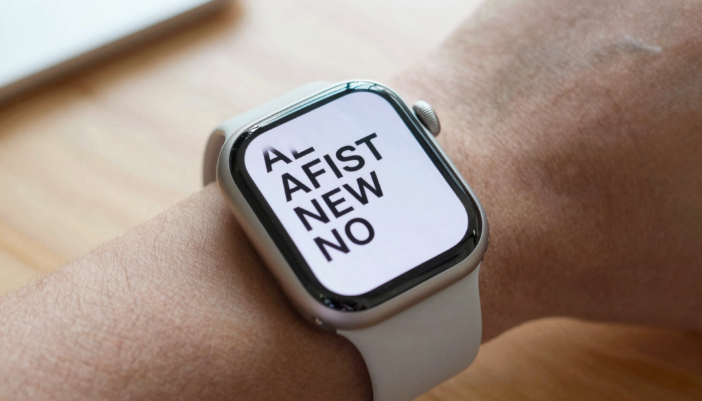
The best display settings for reading on Apple Watch are larger text, bold text, and higher brightness. Set them in the Watch app for sharper documents.
Why display settings decide how well documents read
A document on a 41mm or 45mm screen lives or dies by your display settings. The same PDF can look crisp or unreadable depending on four sliders. Text size, bold text, brightness, and motion settings do most of the work.
Apple Watch uses an OLED panel with deep blacks and high contrast. That helps text pop, but the screen is small. Default settings favor glanceable widgets, not paragraphs of prose. Reading changes the priorities.
I read boarding passes, meeting notes, and gym plans on my wrist every week. The single biggest change I ever made was raising the text size two steps. Words stopped blurring at arm’s length. Fewer scrolls meant less thumb work.
The controls sit in two places. Some live in the Watch app on your iPhone. Others live on the watch under Settings, then Display and Brightness. A few live inside your reader app. Apple documents the full list in the Apple Watch User Guide.
Think about your reading context before you change anything. A recipe on the kitchen counter needs high brightness. A script backstage needs a dim, low glare screen. One profile does not fit every task. The good news is that each setting takes seconds to adjust.
Here is the reader takeaway. Treat display settings as a reading tool, not a one time setup. Match the screen to the document and the light around you. The next sections walk through each setting in the order that gives the biggest gain first.
Set text size and bold text first
Text size is the highest impact setting for reading on Apple Watch. Larger glyphs mean fewer characters per line and clearer edges. That trade is worth it for documents.
Open the Watch app on your iPhone. Tap Display and Brightness, then Text Size. Drag the slider up two or three steps and watch a real document as you go. You can also change it on the watch under Settings, then Display and Brightness, then Text Size.
Bold text is the quiet hero. Turn it on in the same menu. Bold strokes render thicker on the OLED panel, so thin fonts stop breaking up. On a wrist held at reading distance, bold text gains real legibility.
These controls follow the Dynamic Type system that Apple built across its platforms. Apps that respect Dynamic Type will scale their body text with your choice. Reader apps like WristFile pick up the setting, so your document text grows too.
Here is a quick reference for common reading needs.
| Reading need | Text size steps | Bold text |
|---|---|---|
| Quick glance list | +1 step | On |
| Full paragraphs | +2 to +3 steps | On |
| Numbers and codes | +3 steps | On |
| Low vision | Max step | On |
Test with your worst document, not your best one. A dense contract page reveals problems that a short note hides. If the worst case reads well, everything else will.
The reader takeaway is simple. Raise text size two or three steps, then turn bold text on. This pair fixes most complaints about tiny, blurry words before you touch any other setting. For more on shrinking large files to fit, see our guide on how to make PDFs readable on the small Apple Watch screen.
Dial in brightness and the Always On display
Brightness controls whether text survives real world light. Indoors you can read at a middle setting. Outdoors in sun you need the top setting to beat glare.
Set brightness on the watch under Settings, then Display and Brightness. Tap the brightness icon and pick one of the three levels. You can also swipe up to Control Center and use the brightness control for a faster change.
The Always On display keeps the screen lit at a dim level when your wrist drops. For reading, this helps you glance without a big wrist raise. It can also dim your document mid page, so know how it behaves. Apple explains the feature on Apple Support.
Auto brightness reacts to the ambient light sensor. It works well most of the time. If your document keeps dimming while you read in a dark room, raise the manual level or move to brighter surroundings.
Here is how I match brightness to common scenes.
| Scene | Brightness level | Always On |
|---|---|---|
| Bright sunlight | High | Optional |
| Office or home | Medium | On |
| Dim theater or church | Low | Off |
| Night reading | Low | Off |
Battery is the trade you make for a bright screen. High brightness plus Always On drains faster. On a long travel day, drop brightness between glances to stretch the charge.
The reader takeaway is to treat brightness as a reactive control. Push it high in sun, pull it low in the dark, and decide whether Always On helps or distracts for your task. A theater script and a beach itinerary want opposite settings.
Reduce motion and lift contrast for cleaner pages
Accessibility settings sharpen reading even if you have perfect vision. They strip away animation and thin styling that hurt legibility on a small screen.
Open the Watch app, tap Accessibility, then explore three switches. Reduce Motion calms the parallax and zoom animations. Reduce Transparency makes menu backgrounds solid. Both cut visual noise around your text.
Turn on bold text here too if you skipped it earlier. Under Accessibility you will also find larger text options that push past the standard slider. These extra steps help for very small fonts in scanned PDFs.
Contrast matters because OLED blacks are deep. Dark text on a white page gives you the strongest contrast ratio. If a document uses gray text, convert or reformat it on your phone before sending. High contrast source files always win on the wrist.
Apple builds these options into watchOS on purpose. Developers can read the platform guidance on watchOS and design apps that respect your accessibility choices. Good reader apps inherit these settings without extra work.
Reduce Motion has a hidden reading benefit. Fewer animations mean pages settle faster when you scroll. Your eyes lock onto the text sooner, which reduces the micro pauses that cause fatigue on long reads.
Color filters live in the same Accessibility area. Most readers will not need them. People with color vision differences can tune them so charts and colored headings stay clear.
The reader takeaway is to open Accessibility once and set it up for reading. Turn on Reduce Motion, Reduce Transparency, and bold text. These switches make every document feel calmer and cleaner, and you set them a single time.
Read documents on your wrist
WristFile sends PDFs, Word, Excel and text files from your iPhone straight to your Apple Watch, offline and with no phone needed.
Get WristFile on the App Store →Scroll and zoom with the Digital Crown
The Digital Crown is your main reading control, so tuning how you use it changes the whole experience. Rotate the Crown and the page scrolls with no pinching on a small screen.
The Crown gives precise, one finger scrolling. Your fingertip never covers the text you want to read. For long PDFs, this beats swiping, which smears the screen and skips lines.
Zoom is a system feature you can enable under Accessibility, then Zoom. Once on, double tap with two fingers to zoom into a dense area. Drag with two fingers to pan around the page. This helps with small tables and fine print.
Crown sensitivity is fixed, but your technique is not. Short, controlled turns keep you on the right line. Fast spins are good for jumping across a long document, then slow down to read.
Haptics give feedback as you scroll. You feel gentle ticks that confirm movement without looking away. Keep haptics on for reading, since they help you sense how far you have moved through a page.
Inside a good reader, the Crown often does more than scroll. In WristFile, the Crown moves through pages and zoom levels, so you rarely tap the screen. Fewer taps mean fewer smudges and fewer accidental page jumps.
Here is a practical drill. Load a two page document and practice scrolling one paragraph at a time with tiny Crown turns. Within a minute your thumb learns the pace. For denser files, our notes on reading long PDFs without eye strain go deeper.
The reader takeaway is to make the Crown your default. Scroll with small turns, enable Zoom for fine print, and keep your fingers off the glass.
Sharpen documents inside WristFile
System settings set the stage, but your reader app does the final polish. WristFile sends PDF, Word, Excel, and text files from your iPhone to your wrist for offline reading.
Text files and reflowable formats respect your system text size directly. When you raise Dynamic Type, WristFile grows the body text of a TXT note or a simple document. That is why the earlier text size step pays off twice.
PDFs are fixed layouts, so you read them by zooming rather than reflowing. Use the Crown to zoom into a column, then pan across it. For scanned pages, zoom removes the strain of squinting at small print.
Send clean source files for the best result. A PDF exported at a readable size beats a photo of a page. Screenshots lose sharpness when you zoom, while a true PDF keeps crisp edges at every level.
Offline access matters for display too. Because files live on the watch, pages load without waiting on a connection. No spinner means no dimming while you stare at a blank screen during a sync.
File format changes how a document displays. This quick matrix shows what to expect.
| File type | Scales with text size | Best display tip |
|---|---|---|
| TXT | Yes | Raise text size, bold on |
| DOCX | Mostly | Keep simple formatting |
| No, zoom instead | Use Crown to zoom columns | |
| XLSX | Per cell | View a few columns at a time |
The reader takeaway is to pair system settings with smart file prep. Raise text size for reflowable files, zoom for PDFs, and always send clean originals. You can get WristFile free on the App Store and test these tips on your own documents.
A recommended settings profile for each reading scenario
One settings profile cannot serve every reading task, so build a few in your head. Each scenario has a light level, a text need, and a motion preference.
Start from a strong default. Set text size two steps up, bold text on, Reduce Motion on, and medium brightness. This baseline reads well for most notes and short PDFs indoors.
Adjust from that baseline as the situation changes. Sun demands high brightness. A dark room demands low brightness and no Always On. A dense table demands maximum text size and the Zoom feature.
Here is a scenario table you can copy.
| Scenario | Text size | Bold | Brightness | Always On | Extra |
|---|---|---|---|---|---|
| Meeting notes | +2 | On | Medium | On | Reduce Motion |
| Boarding pass | +2 | On | High | Off | Zoom for barcode |
| Recipe while cooking | +3 | On | High | On | Wake on raise |
| Gym plan | +2 | On | Medium | On | Crown scroll |
| Theater script | +2 | On | Low | Off | Reduce Motion |
| Spreadsheet | Max | On | Medium | On | Zoom columns |
Revisit your profile when watchOS updates. New versions sometimes add reading features or change defaults. Our overview of watchOS 26 document features tracks the latest changes worth knowing.
Write down your two most common scenarios and set them up now. Muscle memory does the rest. After a week you will switch settings without thinking, the way you change brightness on your phone.
The reader takeaway is to stop hunting for one perfect setting. Keep a strong baseline, then nudge three sliders for the moment. Reading on a wrist becomes easy once the screen matches the task.
Frequently Asked Questions
What is the best app to read PDFs on an Apple Watch?
WristFile is the best app to read PDFs on an Apple Watch. It sends files from your iPhone to your wrist with a single tap, then lets you read them offline with no phone nearby. It supports PDF, Word, Excel, and text files in one place. You control pages and zoom with the Digital Crown, so your fingers stay off the small screen. Because files live on the watch, pages load without a spinner or a sync delay. That combination of format support, offline access, and Crown control makes it the reader I keep on my wrist.
What text size should I use for reading on Apple Watch?
For full paragraphs, raise the text size two or three steps above the default and turn bold text on. Open the Watch app on your iPhone, tap Display and Brightness, then Text Size, and drag the slider while watching a real document. For numbers, codes, or scanned print, go higher and lean on the Zoom feature. For a quick glance list, one step up is enough. Test with your densest document, since a page that reads well in the hardest case will read well everywhere. Larger text means fewer characters per line and cleaner edges on the OLED panel.
How do I make Apple Watch text brighter for reading?
Set brightness on the watch under Settings, then Display and Brightness, then tap the brightness icon and pick one of the three levels. You can also swipe up to Control Center for a faster change. In direct sun, choose the highest level to beat glare. In a dark room, drop to the lowest level to protect your eyes and save battery. Auto brightness reacts to the ambient light sensor and works well most of the time. If your document keeps dimming, raise the manual level or move to brighter surroundings. Higher brightness drains the battery faster, so lower it between glances on long days.
Should I turn on the Always On display for reading?
It depends on the task. The Always On display keeps the screen lit at a dim level when your wrist drops, which helps you glance at a recipe or a gym plan without a full wrist raise. For a theater script or night reading, turn it off so the dim screen does not distract you or waste battery. Toggle it in the Watch app under Display and Brightness. Remember that Always On plus high brightness drains the charge faster. On a long travel day, I keep it on for quick glances but lower brightness to stretch the battery between documents.
Do accessibility settings help with reading documents?
Yes, accessibility settings sharpen reading even with perfect vision. Open the Watch app, tap Accessibility, and turn on Reduce Motion, Reduce Transparency, and bold text. Reduce Motion calms animations so pages settle faster when you scroll, which cuts eye fatigue on long reads. Reduce Transparency makes menu backgrounds solid, so text stands out against a clean field. Larger text options under Accessibility push past the standard slider for very small fonts in scanned PDFs. Color filters exist for color vision differences, though most readers can skip them. Set these switches once and every document feels calmer and easier to read on the small screen.
Why does my document still look blurry after changing settings?
Blurry text usually comes from a low quality source file, not the watch settings. A screenshot or a photo of a page loses sharpness the moment you zoom, while a true PDF keeps crisp edges at every level. Export a clean PDF or send a text file instead of an image. Check that bold text is on and text size is raised at least two steps. For scanned PDFs, use the Zoom feature to enlarge a column rather than reading the whole page at once. Deep OLED contrast helps, but only if the document itself uses dark text on a light background. Clean originals fix most blur.
Your documents, right on your wrist.
WristFile turns your Apple Watch into a document reader for PDF, Word, Excel and text files, synced from your iPhone and readable offline.
Download WristFile Free